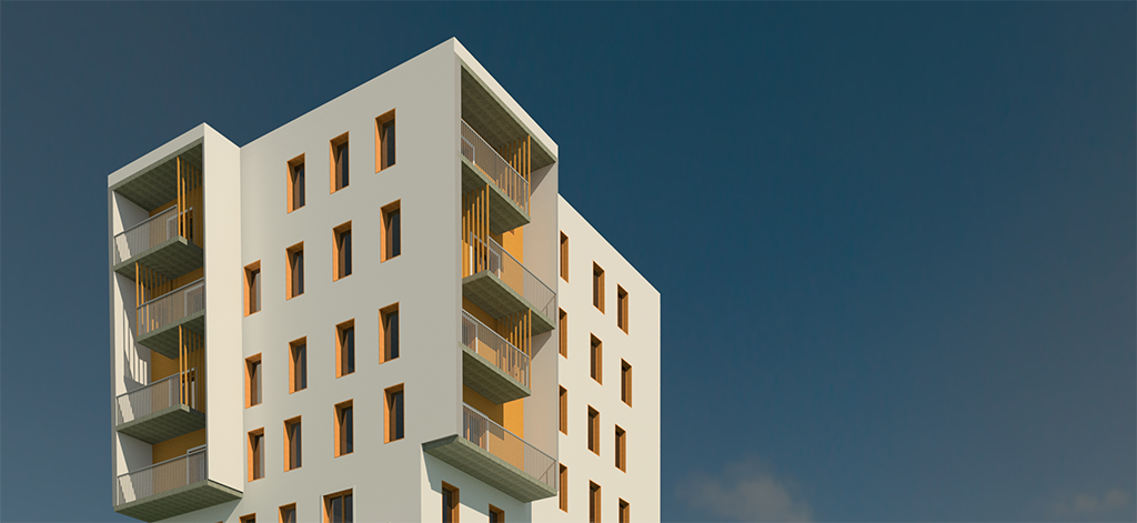
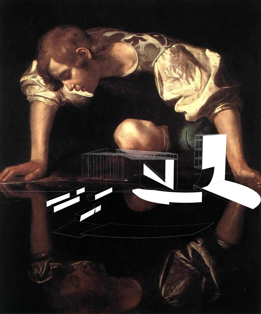
The base idea of the building was that all the apartments have double orientation and to separate the building in four parts based on function and the way of living.
Garage – half the floor is above the ground, in order to create a bright and ventilated space as a contrast to the usual dark garages.
Business – extends over two floors and is clearly distinguished on the facade. The open and glassed space meets the needs of companies but also of individual offices, shops, etc, in one of its parts it can be connected with the apartment area and become an extension of living/working, depending on the actual need. It can also simply be an office of a person living above (for example a lawyer).
Housing – there are two types of apartments; family housing, located in the part of the building with gallery spaces and the student or single person housing in the ‘tower’. They are separated by the business area due to the nature of living and philosophy of the apartment . The gallery part has larger flats and is oriented towards the two opposite sides of the building. The apartments are accessed through the gallery space, which is actually an extension of the public space of the building. It represents both a hallway and a terrace situated among the green treetops. Smaller apartments for students, couples and people living on their own are situated in the tower. The shape of the tower was also suitable for providing a two-sided orientation of each apartment as well as for creating a dynamic outline of the building.
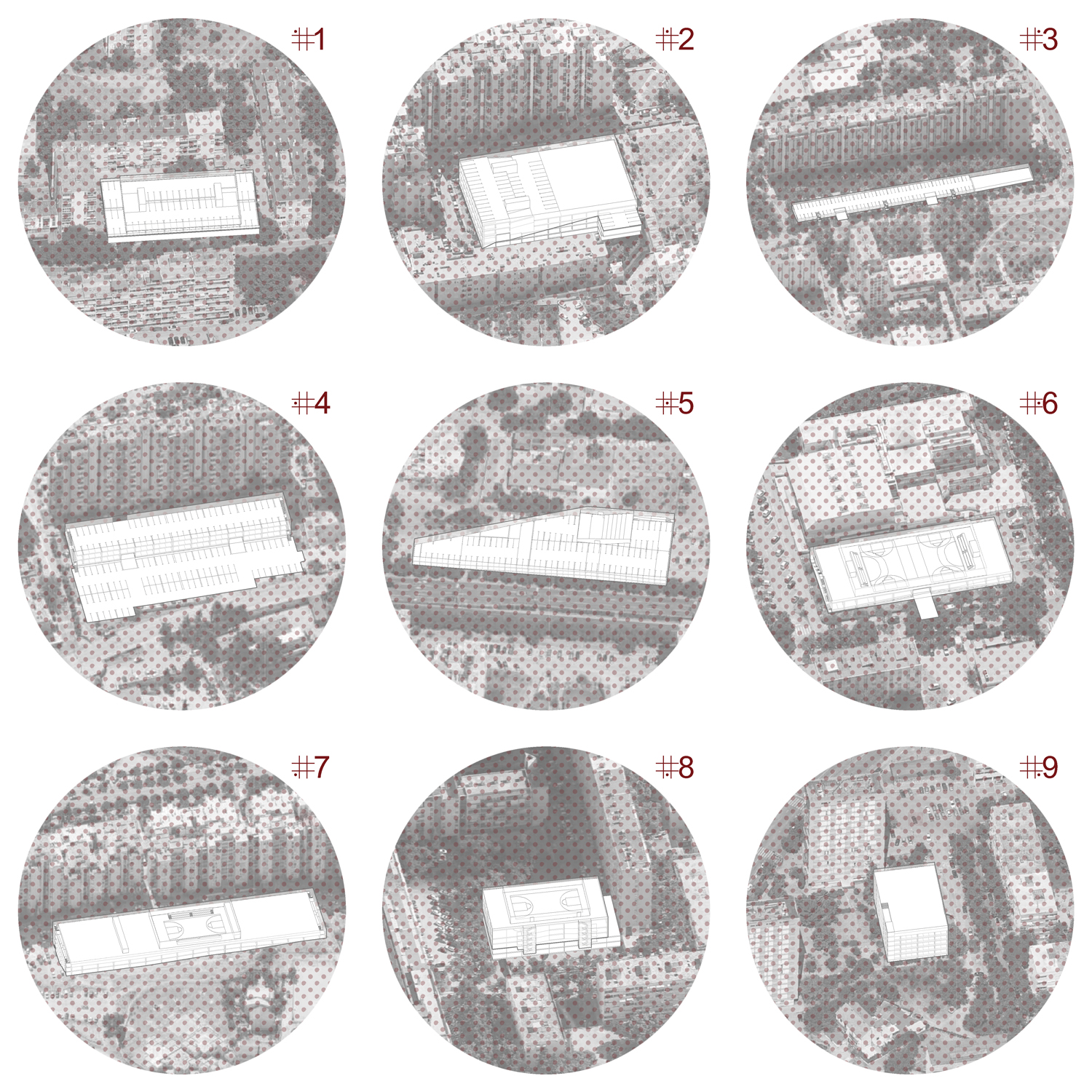
Site plan – The object is planned as one of three objects, similar by size, which represent landmarks along with the tower, both in the village and the broader city silhouette. For the very objects, the greenery in between them is very important, as it is a part of the buildings, but also of the platform between the buildings.
Student: Aleksandar Šepa, Banjaluka
[Best_Wordpress_Gallery id=”101″ gal_title=”AleksandarŠepa”]
