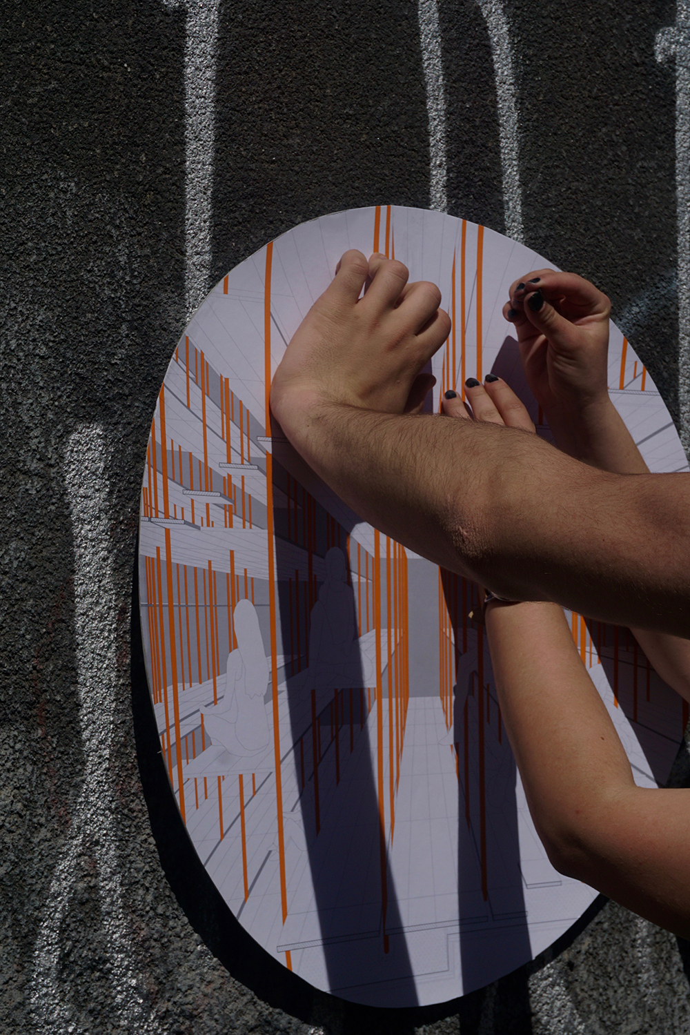
Anamorphosis (Noun): 1. A distorted projection or drawing which appears normal when viewed from a particular point or with a suitable mirror or lens. From Greek anamorphosis ‘transformation,’ from ana-’back, again’ + morphosis ‘a shaping’ (from morphoun ‘to shape,’ from morphe ‘shape, form’). _ Oxford English dictionary
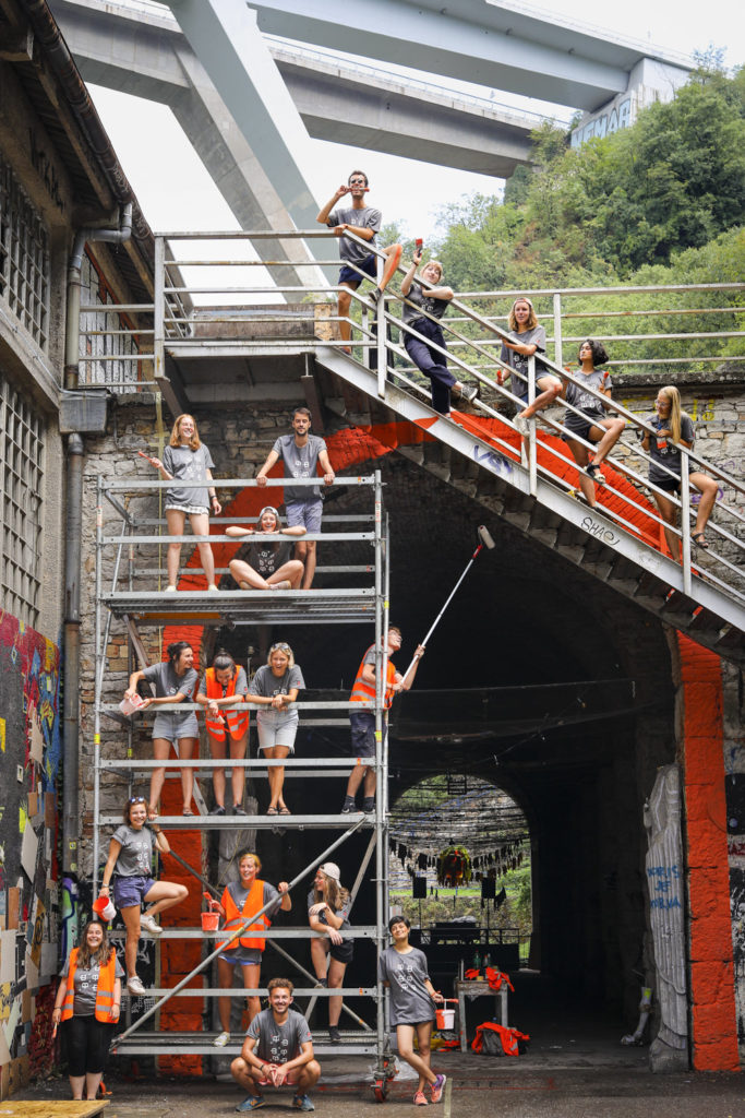
Spotlight is an artistic intervention that took place during the annual European Architecture Students Assembly (EASA) in Rijeka, Croatia, assembling 500 students and young professionals from more than 40 different countries. It served as a tool to question urban space in the context of Rijeka, and play with the relationship between landscape and architecture. The anamorphosis technique was our provocative medium for achieving this goal. It produces confusing and unsettling experiences of perspective that force the viewer to question space and their perception of it. Designing and painting an anamorphosis require specific attention to context – it cannot work if you skip this part of the process, which is another reason why we chose this medium.
To rediscover urban space, architecture and very basic notions of space, perspective and optical illusions, the participants were given this tool. With the same provocative spirit as the RE:EASA concept, we wished to put a spotlight on disused, “banal”, unrevealed places. It is our hope that these interventions will catch viewer’s attention so that people look at these places with a new eye, to question what they see there and change their way of seeing these spaces, in order to give them new value.
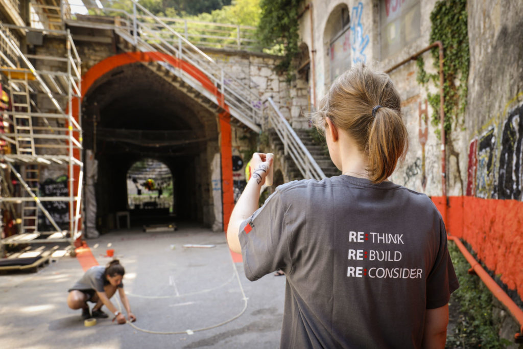
In the framework of RE:EASA, we were housed in an abandoned warehouse, and the bar of the event was housed in Hartera. Spotlight highlighted Hartera, an old paper factory in the heart of Rijeka, that was shut down in 2005. It is a relique of the industrial golden age of the city: one of the biggest manufacturers of cigarette papers in Europe until its closure in 2005. Since then, it has been used for music festivals, and welcoming people in need of shelter and artists. The interrelation between nature and architecture is especially interesting here: located in the canyon of the river Rječina, the slopes are covered with forest that recolonizes the factory little by little. The whole area is interrelated with nature that has been dominated by mankind. The river was used to give power to the factory. Above the factory, the hills have been perforated several times to fit seven tunnels for infrastructural needs. Power poles run along the hills. A motorway bridge connects the two hills. One branch of the river is dry because of the dam that was built a few kilometers above.
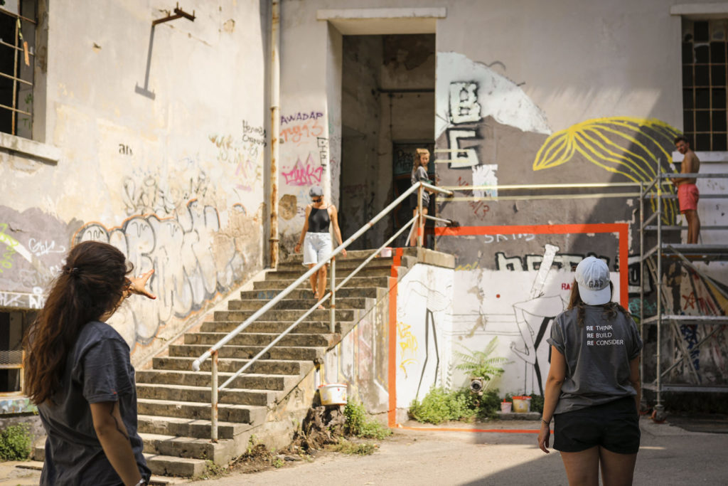
Hartera is hidden behind the hill of the castle, but linked to the city and the port by the river. It was the playground where we experimented with anamorphosis to reveal and punctuate the discovery of this disused industrial area.
Over the course of the two weeks, we unanimously agreed that this work should serve the purpose of marking our presence in these locations where we worked. Marking our presence would be a way of showing others that we were here, inhabiting, dwelling, using these usually abandoned and unused or undervalued spaces. Our interventions wish to speak to the viewer ‘Look, we can still do something here! These spaces have stories, history and value.’
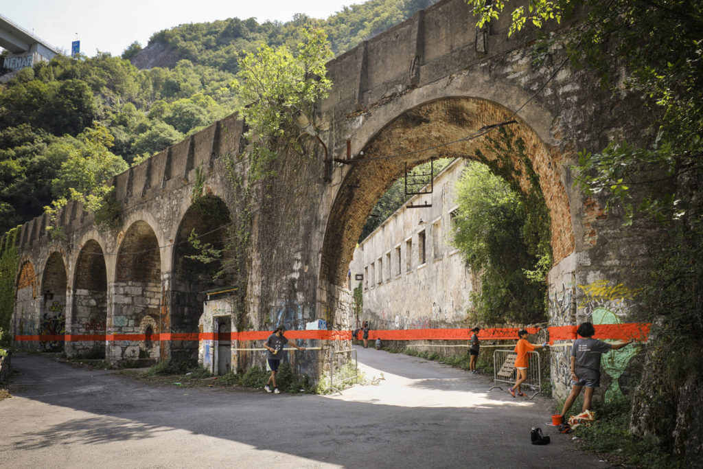
We agreed that there is immense value in having this kind of empty space in cities and towns and we recognize that the Hartera Paper Factory is today already a thriving source and haven of creativity with many frescos, graffiti, collages and newly built skate ramps. This empty place that may be considered run down and undervalued is actually thriving with creativity, inspiring people from all over the world to create and celebrate. Our intervention wishes to celebrate this in a sense and “spotlight” how valuable this kind of “run-down” space is for a city, and more specifically for Rijeka.
The workshop began with two days of exploration and context analysis. We wandered around the factory but also around the city, discovering the local maritime museum and the castle, the highest point of the city, so as to understand the geographical, historical and cultural context of the factory within the city of Rijeka. Another group of participants went to meet locals to learn about their point of view on the factory and its status in the city today.
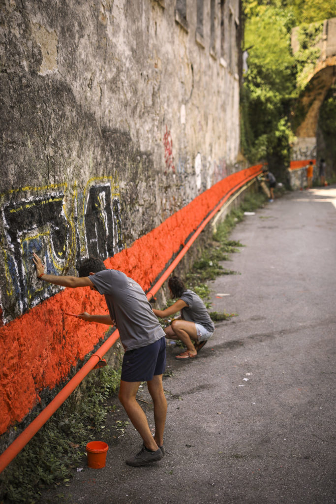
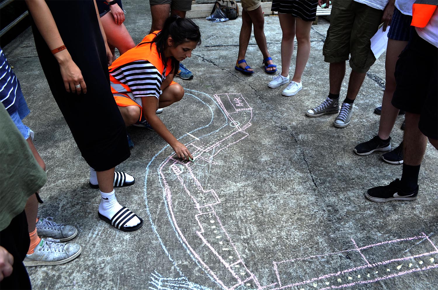
After this exploration, we mapped out the factory and chose spots that we found interesting to work on. We split into smaller groups, according to the spots on our map, and they drew designs for their location. The participants were completely immersed in the design process and experimented with different techniques to project their designs. After some failures and successes, the group determined that the most efficient technique was just doing things the old-fashioned way: directing people with your own eye! After all, no projectors were needed, just a rope or a ruler and your voice to guide your fellow companion from the standpoint were enough for us to project our designs onto the different surfaces.
Today in Hartera, you can find this work. The line, the arch and the squares.
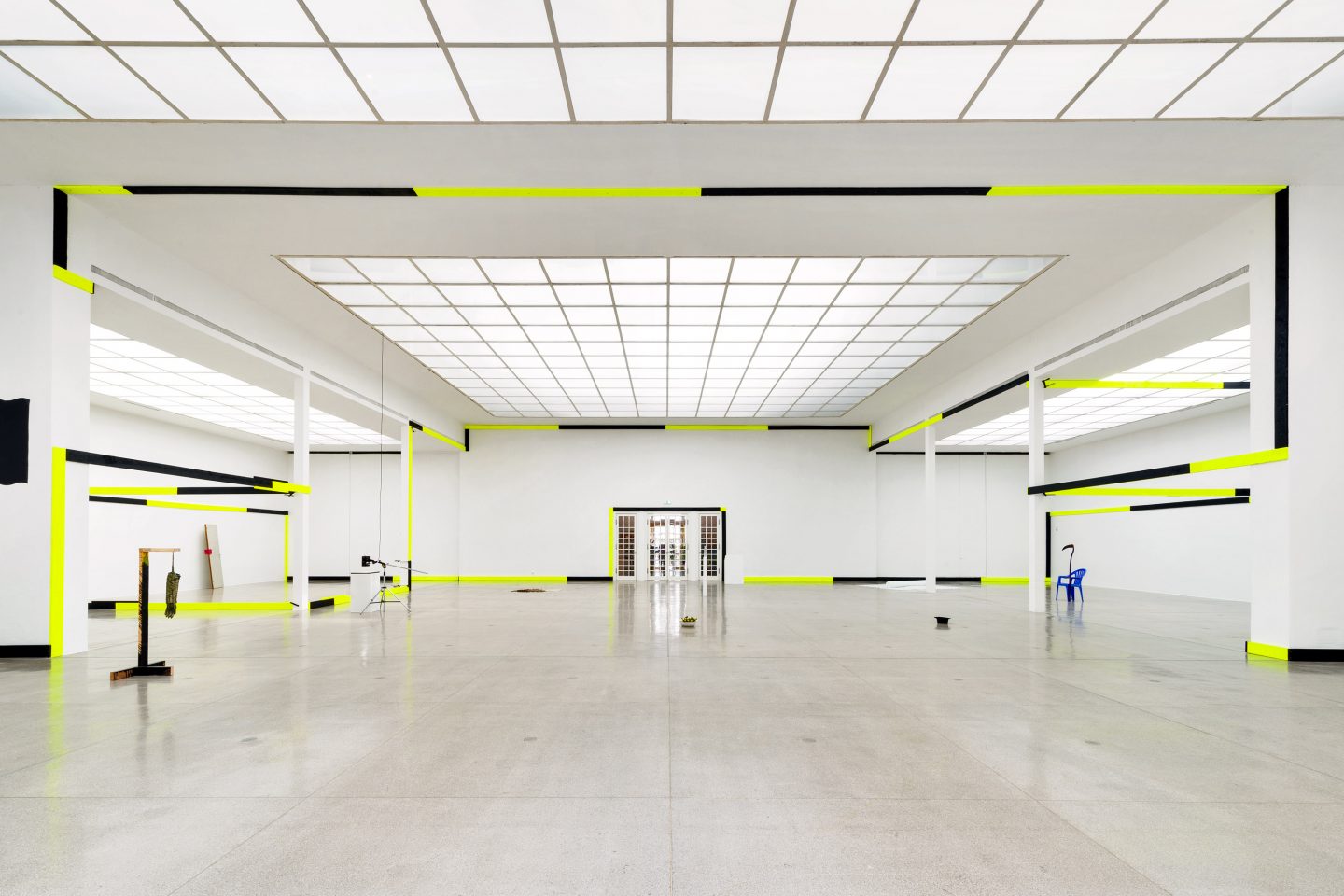
The designs were made to highlight specific elements of the space of the projection: highlighting a specific element of the landscape, or contrasting with the very composition of the space to make people look at it with a new pair of eyes, or playing with the architecture itself.
Organisers, thank you. Especially to Alma and Marin who followed our process the whole time.
More workshop photos here.
[Best_Wordpress_Gallery id=”150″ gal_title=”Spotlight – EASA 2018″]
Tutors: Perrine Cariou, Chloe Macary, Clothilde Josserand, Alexander Mehren
Workshop participants: Andrej Dojcinovski, Andrija Vujovic, Atdhe Hogoshti, Ella Prokkola, Hanne Gulowsen, Leyla Musayeba, Liubou Voutovich, Natalia Malejka, Seela Pentikäinen, Sophie Moehrle, Teuta Bajrami, Urska Malic, Viktoria Hevesi, Vincent Schmitt, Dora Dixon, Chichek Bayramly
Workshop helper: Cazembe Henri
Text: Clothilde Josserand, Chloe Macary, Perrine Cariou
Foto: Alexandra Kononchenko, Chloe Macary, Peter Fabijan
