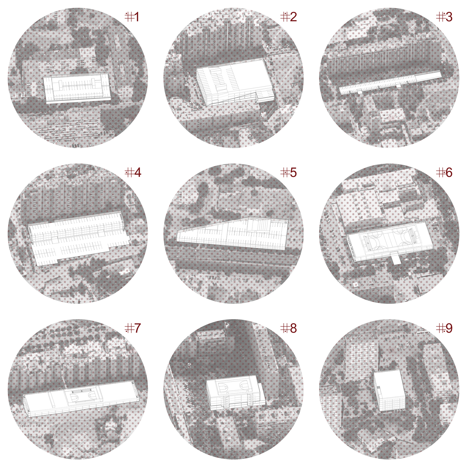
Under the initiative of the Young Architects Program, founded to promote and support young architecture, and in collaboration with the MAXXI museum in Rome, the proposed taks deals with the multifunctional, temporary courtyard space of the museum. Words about one of the five finalist projects are brought to you by the authors, Studio KolendićKrmek:
PALIMPSESTUS; (lat.) something reused or altered but still bearing visible traces of its earlier form
To reflect on the pavilion growing inside the courtyard of the MAXXI Museum is to meditate upon its exterior. It is a contemplation about the outer space of a fancy museum that tries to persuade us to join it. It tries to get us into its shadow and rejoice in its greatness and grandeur. To be a passive observer and devourer of its ideas and other people’s art. Sometimes it is successful, sometimes less so; sometimes people are aware of such performances, and sometimes they believe it.
The pavilion arises in response to the monumentality of the museum. The museum itself claims to be public and intended for the public and that everyone is welcome under its wing, but reality hides so much awe with which it rules its micro- and macrolocation that only those with a pure intention enter; employees, tourists, art lovers … There are no random passers-by, neighborhood people and families with children … So the theme of the summer pavilion is actually the theme of a public space and everything that belongs within that adjective.
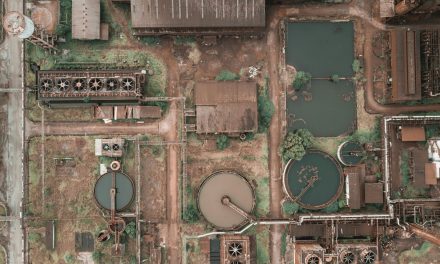
The motif imposed in the city such as Rome is layers – spatial and temporal layers. Rome is full of experience when it comes to layers of life, labor, population and migration, layers of natural disasters, political and social turmoil, the folds of the phases and the wind, and the twigs of the environment and the landscape. In the infinite history of the city, the context is everything, and at the same time nothing; it is leaping in the depths and reveals to us the layers, some taken into account, some neglected.
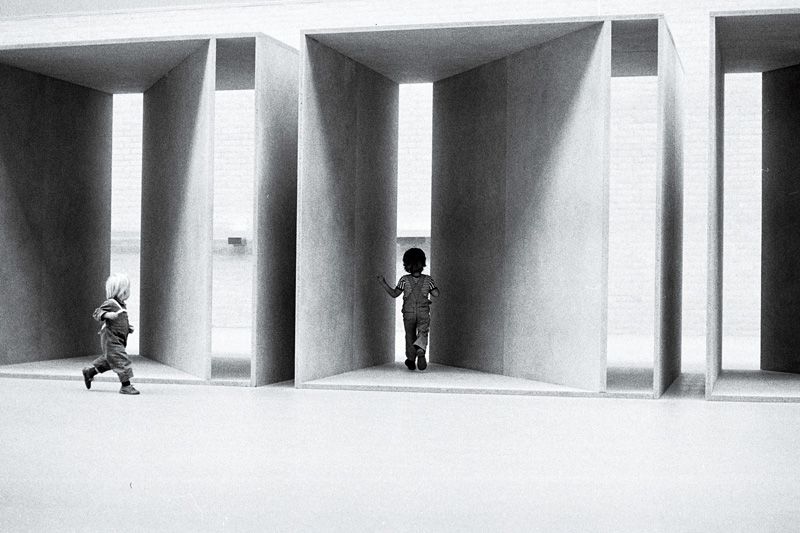
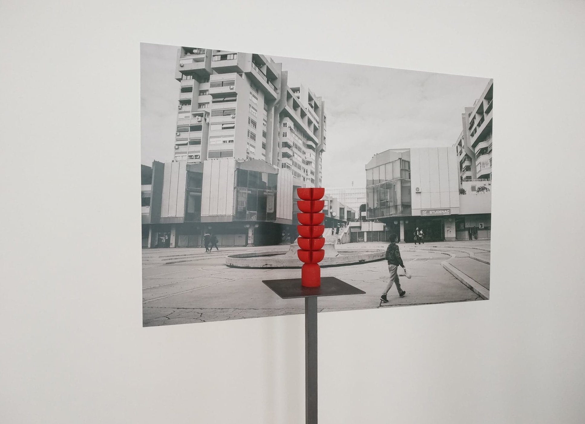
- Donald Judd, Untitled, 1980
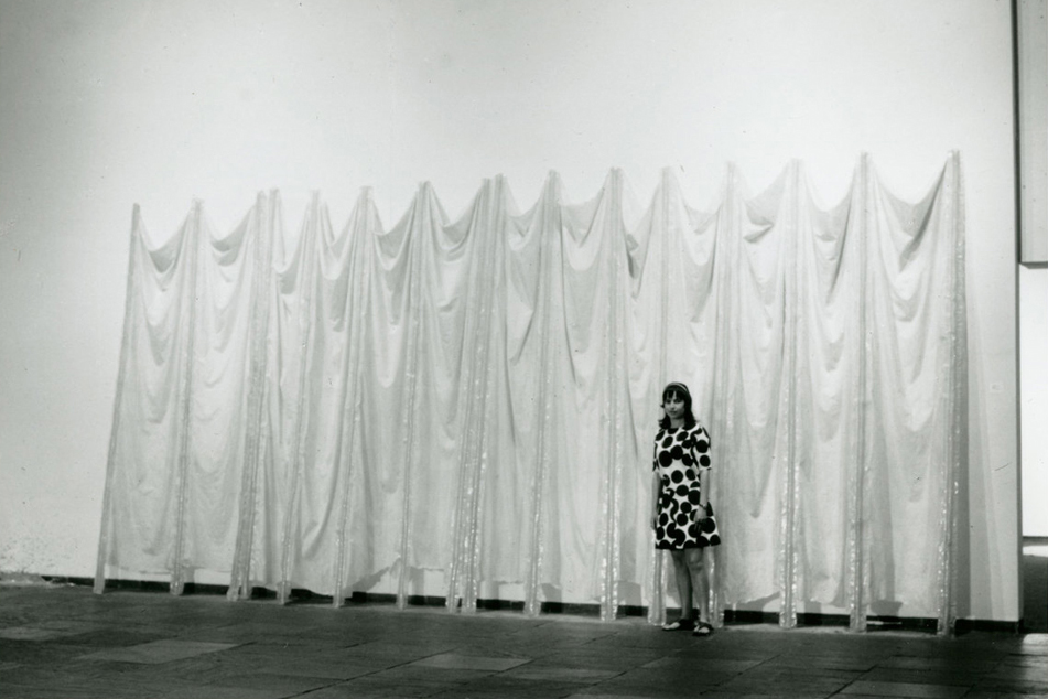
- Eva Hesse, Expanded Extendion, 1969
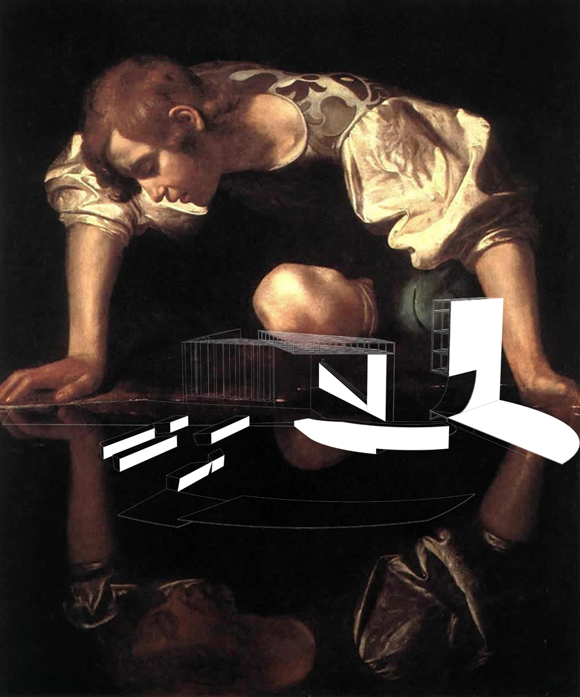
Starting from the current context, we only take what suits us in order to design a new pavilion, precious to this time, but with the indications that something below or behind nevertheless existed. We refer to the inevitable size and form of the museum, to the traces of a past time and to the soil deep below the foundations that witnessed history before MAXXI, to the spatial elements which marked Rome and made a little cliché of it. We become inspired with the colors, tones and shadows of the Baroque, that renaissance phase of Rome as a city. The lines that emerge are imaginary, symbolic, illusionist; nonetheless sufficient to leave a mark.
Accentuated horizontality of the former military barrack roofs and its equal distribution on the ground has continued in the present time, thus creating minor elements as benches or reflections, sufficient for us to perceive that genius loci. We exploit the arc element, so dear to everyone who engages with Rome. We are not using it as a constructive element that holds something more substantial, but we take its segmented negative and insert it into something unexpected. The design method borrows from the aforementioned Baroque – an era defined by ardent light contrasts, illusions of deep space and perspective, reaching out of darkness into light, shadow manipulation…
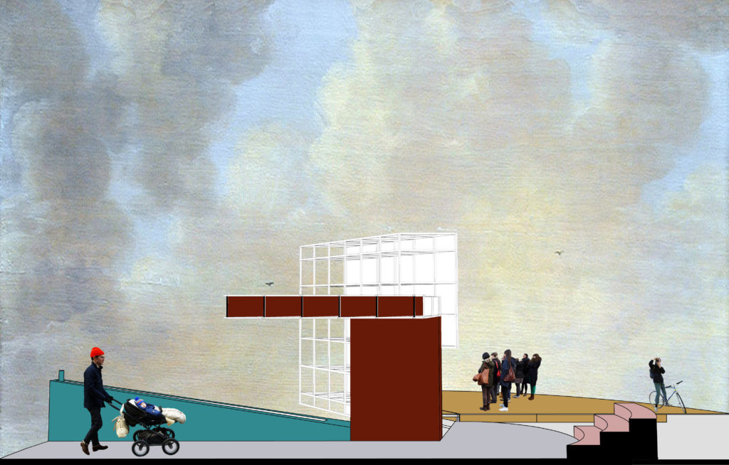
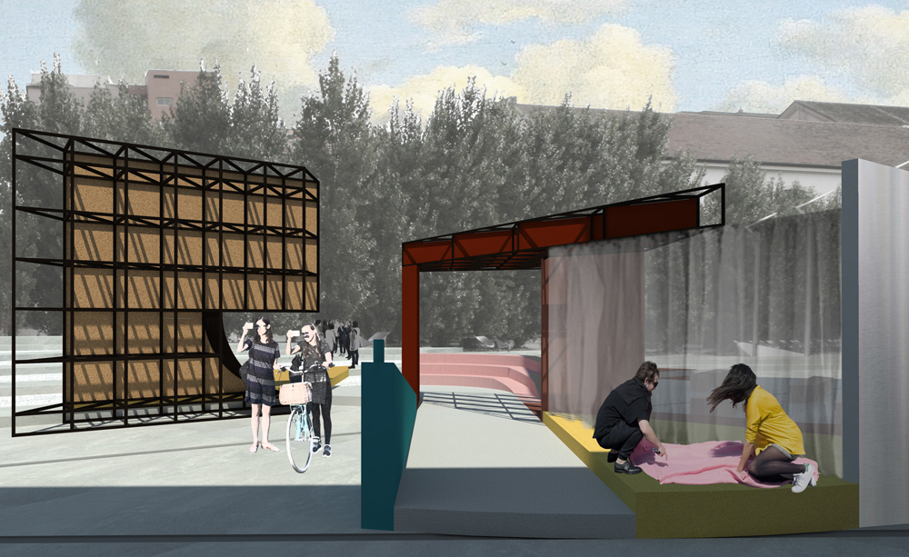
- pavilion cross-section
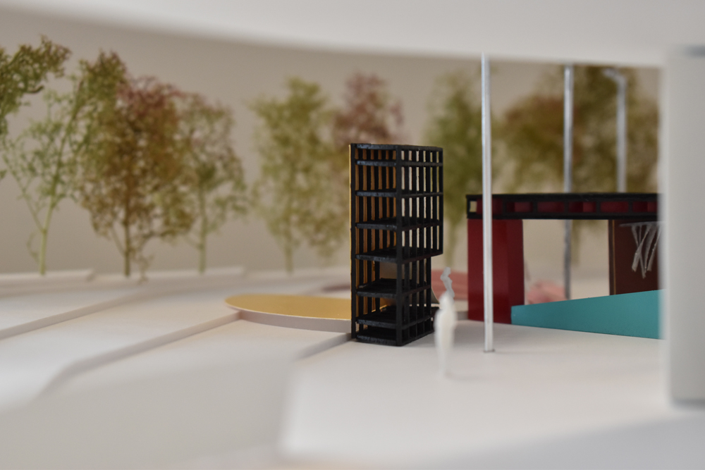
- scale model, author Tin Jakopec
By folding all of these layers one atop another, exporting them from horizontal to vertical, out of shadow into light, from edge to focus, we get the historical site of this particular moment and this particular world outlook. Such archeology of the moment manifests, in a way, the desire to restore the public space to its true meaning: as a space for play, an expression of thought, an arena for unintentional acquaintances, the discomfort of meeting strangers, a stage for acting on social roles and positions we usually do not belong to… An ambience of imperfect elements has been created, in whose relations we lose ourselves visually and perspectively.

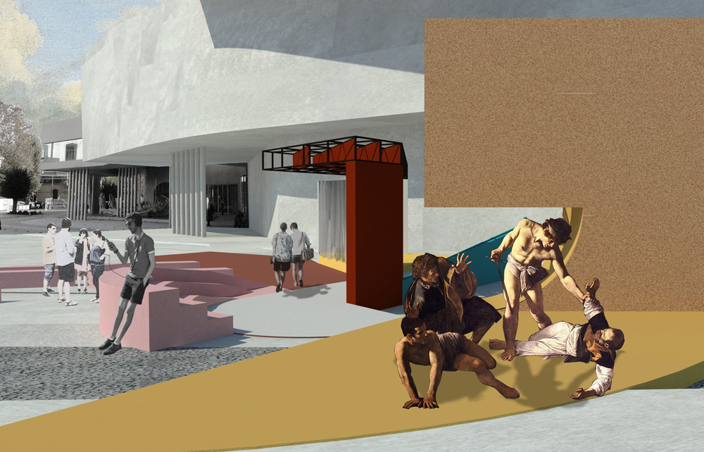
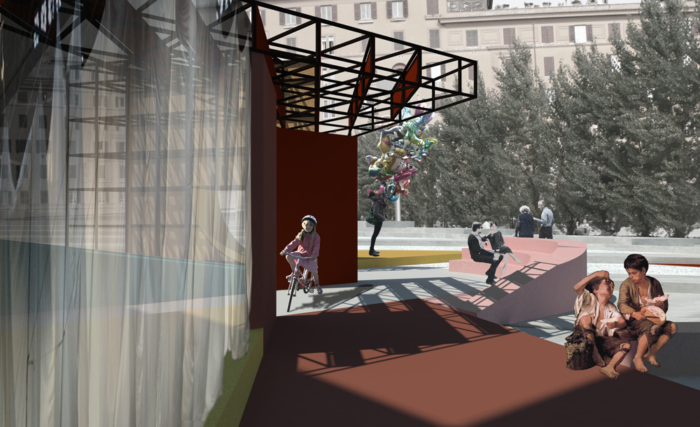
scenarios of use
Trying to reverse David Riesman’s thesis about an individual in the post-industrial society lost in a lonely crowd, the playground for a modern man has emerged, constantly in yearning and fear of missing out. The objects themselves are resolutely non-narrative, but their relations are the ones telling the story and the reasons we read the pavilion in its entirety and as a whole. Like Richard Sennet, who is opposed to the new age city planning5 in which the resolved traffic network equals resolved urbanism, we neglect the movement as a way of directing the design process itself. Instead, it is an instinctive result of spatial manipulation.
Such public sprawling can reach all areas that need some form of intervention. In order to limit it and subdue the pavilion to the human scale, we overlay a form without beginning and end, direction or frontier, form that spreads out its forces equally around its rim. We settle the base of the circle without the scale and the context so that the pavilion is draped by that sphere of influence.
author: Studio KolendićKrmek
MAXXI museum pavilion, Rome, 2018

