by Toma Tolj
In 2009, Royal Caribbean Cruises launched Oasis of the Seas, the first ship of what is now the largest class of cruise ships in the world – Oasis – whose features set new standards in cruise ship architecture with a new, increasingly spacious, and more urban-style layout. In many ways, it continues the tradition in which each new class is expected to surpass the competition in terms of on-board content, as well as its size and capacity.
On these ever-larger ships, there is a constant demand for a new level of luxury, a hypertrophy of amenities, and the continual breaking of minor records, which often serve only as a means of attracting media attention. In this domain, Royal Caribbean is greatly aided by architects such as Tom Wright and his firm WKK Architects, who have honed their affinity for luxury on the megaprojects of Dubai skyscrapers and the utopian oases of Arab sheiks. Their task is to ensure that the ship, in addition to being the largest cruise ship of its time, is also among the most luxurious, which results in the expected kitsch and further emphasizes the usual resemblance between modern cruise ships and shopping malls – creating a genius loci (familiar to all but attractive to but a few) of a distorted urban character with an abundance of amenities that surpass previous absurd records.
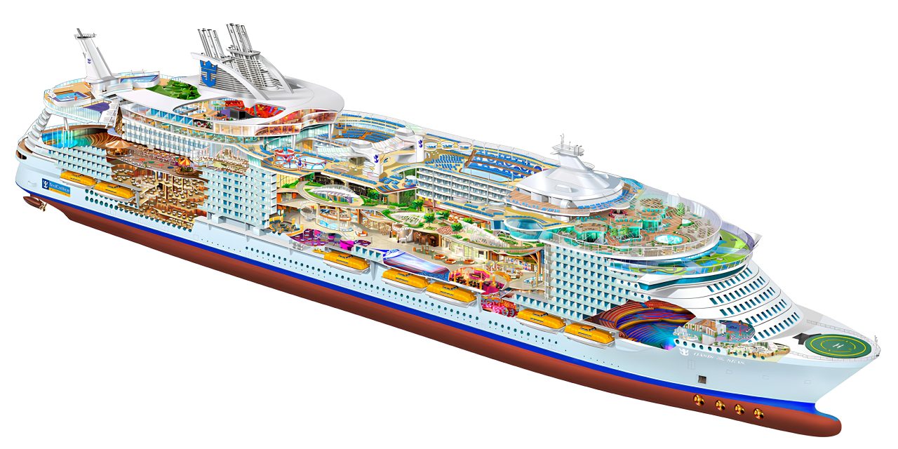
Among the amenities are sports and recreation facilities such as volleyball, basketball and mini-golf courts, an ice rink, five swimming pools, two climbing walls, observation decks and a zip-line cable that spans a nine-story deep chasm in the middle of the ship. There are also supporting amenities, such as restaurants and numerous bars, one of which slowly moves like an elevator between decks, clubs, theatres, and an open-air amphitheatre with fountains. At a length of 360 meters and a height of 72 meters above sea level, Oasis of the Seas held the title of the world’s largest cruise ship, also breaking the record for maximum passenger capacity of 6,000, with around 2,000 crew members, a number that, for comparison, is close to the population of individual neighbourhoods in New Zagreb. The large increase in its height and length is matched only by the growing width of the ship’s hull, reaching up to 60 meters and resulting in a new concept that sets the standard for all future cruise ships of this and other classes.
This leads to the division of the massive volume of the higher decks into three parts: two slabs with a central canyon about 20 meters wide, flanking the towering block. The canyon is an enclosed passageway on the lower decks and an open central park and promenade on the roof. The previously enclosed cabins become rooms with a view in an ambiance previously unseen on a ship – that of an introverted urban environment. The slabs of the block are formed by stacking five decks on top of each other, with a total of 334 balconies or windows looking onto the central space. This canyon is 20 meters wide (for comparison, the width of the Titanic’s hull was 28 meters) and spans nearly the entire length of the ship, connecting seven sections based on the “neighbourhood” principle, oriented towards the amenities surrounding the park and the gallery beneath it.

The previous perception of a cruise ship or any type of vessel is erased, while the space is rapidly urbanized. One of the primary reasons for this is the abrupt shift in how and where the passengers’ attention and movements are concentrated. While people previously gravitated towards the covered outdoor decks to walking along a “waterfront” organised similarly to a coastal town (in which all streets lead to the sea), the main transversal of the ship has now been moved inside, the ship itself pulling them inward. The façades’ profitability is maximized by selling expensive balcony rooms, and it is only on the highest decks that one can stroll outdoors along promenades bypassing the pools and sports fields. But even these decks have almost nothing in common with the shallow ones of the past, which resembled balcony galleries. They have become wide streets bordered with greenery and ever-growing barriers. These high, glazed fences, resembling those around a hockey rink, are designed primarily to keep passengers from falling overboard, but they increasingly deny the fundamental experience of the open sea, the cold breeze, the salty wind. On modern cruise ships, even the open decks are as isolated from the environment as possible – the best view they offer is not towards the open sea, but towards the growing indoor pool.
It is entirely possible to rent a room with a view of the indoor park, to walk along the ship’s streets, to have lunch on artificial Italian piazzas and dine in street bars for a month without ever being bothered by the fact that one is on a ship, moving (or cruising) along the Bahamas. Why would we look at the open sea when we can look at a street we recognize? Every effort is made to divert our attention from the fact that we are traveling, and as a result, there is less and less reason to disembark for a tour of any Caribbean paradise that surely cannot rival the luxury we have grown accustomed to on board. Is this really the goal of cruising, or is it merely the transplantation of familiar consumer-driven typologies to the open sea? With the further increase in size and capacity, rapidly approaching that of a residential neighbourhood, it is time for architects to become more involved in the design of these floating cities, in a way more akin to urban planning than interior decoration and design. We should reassess the function of cruising, explore its potentials, and apply existing knowledge in order to take an expert stance on the character of these new urban spaces, created by expanding the ship’s hull to the width of a city block and beyond.
Images by Beau and Alan Daniels
This article was published in the 8th issue of the Tristotrojka magazine.


